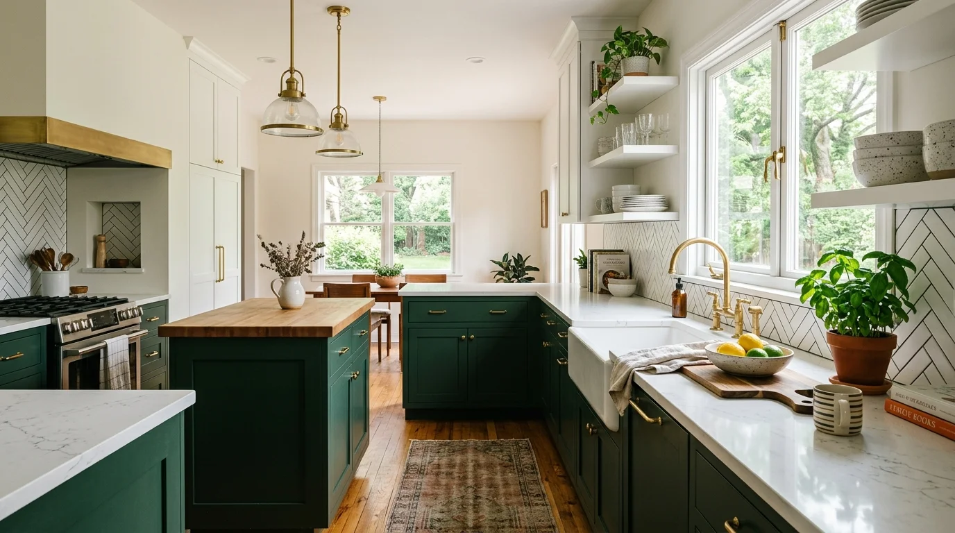
Two tone kitchen cabinets look current when each color has a clear job. The difficult decision isn’t choosing two attractive colors. It’s deciding where the visual break belongs and how the surrounding finishes connect both sides.
Why two tone works in small kitchens
A small kitchen can still carry two cabinet colors. The safest approach keeps the upper half quiet and puts stronger color below eye level. That arrangement preserves an open sightline while giving the room more character.
Start by choosing one dominant neutral. White, cream, mushroom, or pale wood can cover most visible cabinets. Then assign the second finish to a defined area. Lower cabinets, a short pantry wall, or an island can carry the accent.
Avoid switching colors from cabinet to cabinet. That creates several visual stops in an already tight room. One continuous boundary feels calmer. It also makes the layout easier to understand from nearby living spaces.
Consider what you see from the doorway. A City Heights galley kitchen may reveal every cabinet at once. A compact condo kitchen in Downtown San Diego may open directly into the living room. In either case, the first view should show an intentional block of color, not scattered accents.
The wall color matters too. Light upper cabinets against a similarly light wall reduce sharp outlines. Darker base cabinets then provide enough contrast to ground the room. If both cabinet colors contrast strongly with the wall, the kitchen can feel divided into three competing bands.
Before ordering doors, test large samples in the actual room. Move them beside the window, backsplash, and floor. Check them during the times you normally use the kitchen. A small paint chip can hide undertones that become obvious across a full cabinet run.
For more layout-focused ideas, see our guide to small kitchen remodel ideas.
Where to put the darker color
Lower cabinets are usually the easiest place for the darker tone. They create a stable base while keeping upper cabinets visually lighter. This split also follows a natural horizontal line already formed by the countertop.
Use the darker color across a complete lower run when possible. Ending it halfway across one wall can look accidental. A corner, tall cabinet, appliance panel, or doorway makes a more convincing stopping point.
Tall cabinets need special attention. A refrigerator surround or pantry reaches into the upper zone. Painting it dark can create a strong vertical block. That may suit a wide wall, but it can overwhelm a narrow passage. Keeping tall units in the lighter color often preserves the main upper-lower split.
Another option is a single dark cabinet wall. This works when the room has a clear secondary zone, such as pantry storage away from the cooking run. Treat that wall as one piece. Don’t alternate light and dark doors within it.
Black isn’t the only grounding color. Deep green, navy, charcoal, walnut, and muted brown can all provide contrast. The right choice depends on the floor, countertop, and natural light in your specific kitchen. A shaded room in El Cajon won’t present the same sample exactly like a bright room near the coast. Judge the finish inside your home.
Door style can change the result too. Detailed doors create more highlights and shadows. Flat-panel doors show color as a larger, quieter field. If you’re replacing the cabinet boxes or changing the layout, a custom kitchen cabinet pro can help map the finish breaks before fabrication.
Whatever split you choose, document it on every cabinet elevation. Labels such as “dark lowers” aren’t enough. Corner panels, fillers, toe kicks, crown, and finished ends also need assigned colors.
Island as the accent
An island is the cleanest place to introduce a second cabinet color. It already reads as a separate object, so the color change feels deliberate. The perimeter can stay calm while the island becomes the room’s visual center.
This approach works especially well in open layouts. The island may be the first cabinet surface seen from a dining or living area. A deeper finish gives that view more definition without surrounding the cook with dark cabinetry.
Keep the accent complete. The island doors, drawer fronts, side panels, and back panel should follow one color plan. A mismatched end panel can make a finished island look unfinished. Toe kicks may either match the island or visually connect with the floor, but that choice should be specified before materials are ordered.
The countertop can unite the island with the perimeter. Using one countertop material across both areas creates continuity. A different island countertop can work, but it adds another major finish. At that point, the room has two cabinet colors and two counter surfaces. Every additional contrast needs a clear purpose.
Size and location matter more than color. An attractive island still has to fit the room’s circulation and storage plan. Review our kitchen island design guide before committing to the footprint. If the project involves a new or rebuilt island, we can connect you with a local pro for a kitchen island build or replacement.
Some island projects may require permits, depending on their scope. A kitchen-specific permit trigger could not be confirmed. Check the proposed work with City of San Diego Development Services when the property is within the city. For homes elsewhere in San Diego County, ask the authority that handles permits for that address.
Matching hardware and countertop
Hardware should connect the two cabinet colors, not compete with them. One finish across both colors is the simplest route. It creates repetition and makes the cabinet split feel planned.
Black hardware can disappear against very dark doors while standing out sharply on white ones. That contrast may be intentional. If you want equal visibility, compare softer metal finishes against both samples. Brushed, polished, warm, and dark finishes react differently beside paint and wood.
Don’t choose hardware under store lighting alone. Place a sample pull on each cabinet finish. Then hold both beside the countertop and backsplash. The metal’s undertone should make sense across the full palette.
Countertops carry even more visual weight. A heavily patterned slab can fight with a strong cabinet contrast. A quieter surface gives the two-tone scheme more room. If the cabinets are close in color, a countertop with some movement may help connect them.
Look for a shared note rather than an exact match. A warm white countertop can bridge cream uppers and walnut lowers. A cooler white may sit more comfortably between crisp white and blue. Exact undertones vary by product, so compare the physical samples together.
The backsplash should support the same plan. If cabinets and counters already create strong contrast, a restrained backsplash often keeps the room balanced. If the other finishes are quiet, tile can add texture without introducing another unrelated color.
Flooring is the final large surface. Dark lower cabinets against a dark floor may merge into one heavy block. A visible difference in tone or texture can preserve separation. Wood cabinets don’t need to match wood floors exactly, but competing orange, red, gray, or yellow undertones can look disconnected.
Make a sample board before approving anything. Include both cabinet colors, hardware, countertop, backsplash, floor, and wall paint. View the group vertically and horizontally. Cabinets aren’t seen flat on a table, so test the materials in their finished orientation.
Combinations that age badly
Two-tone kitchens start looking dated when the contrast depends on a short-lived effect instead of the room’s structure. Random color blocking is the biggest risk. If the second color doesn’t follow an island, cabinet run, wall, or horizontal line, it can look like a later replacement.
Too many statement finishes create another problem. Two cabinet colors, patterned counters, dramatic tile, mixed metals, and bold flooring all ask for attention. Choose one or two focal elements. Let the remaining surfaces connect them.
Very cool gray paired with bright white can feel stark when the room contains warm floors or counters. The problem isn’t gray itself. It’s the lack of a shared undertone. The same issue appears when yellow cream sits beside blue-white paint.
Trend-specific colors can still work when they suit the permanent materials. Don’t choose a cabinet color only because it looks familiar online. Compare it against the surfaces that will remain through future updates. Floors, counters, and large tile areas are harder to change than wall paint or stools.
Avoid splitting colors at awkward heights. Dark lower cabinets, light uppers, and a dark tall pantry can create a jagged outline. Draw the room as simple color blocks. If the boundary looks restless on paper, it will probably feel busier after installation.
Matching every accent can also date the room. Blue lowers don’t require blue tile, blue stools, and blue decor. Repeating the cabinet color once is enough. Materials can relate through warmth, texture, or contrast instead of exact color.
Wood and paint make a durable pairing when the wood tone appears intentional. Watch the grain direction across panels and fillers. Also compare the wood against existing floors. Near matches can be harder to balance than clearly different tones.
Finally, don’t rely on tiny samples or screen images. Screens change color, and small swatches hide scale. Ask the selected pro or supplier for the largest available finish samples. Confirm every visible cabinet component before placing the order.
When to call us
Call when the color split affects new cabinets, finished panels, or an island layout. Those choices should be settled before a licensed kitchen remodeling pro orders or builds the components.
Call us at (858) 400-4623 and we’ll connect you with a licensed local kitchen remodeler.