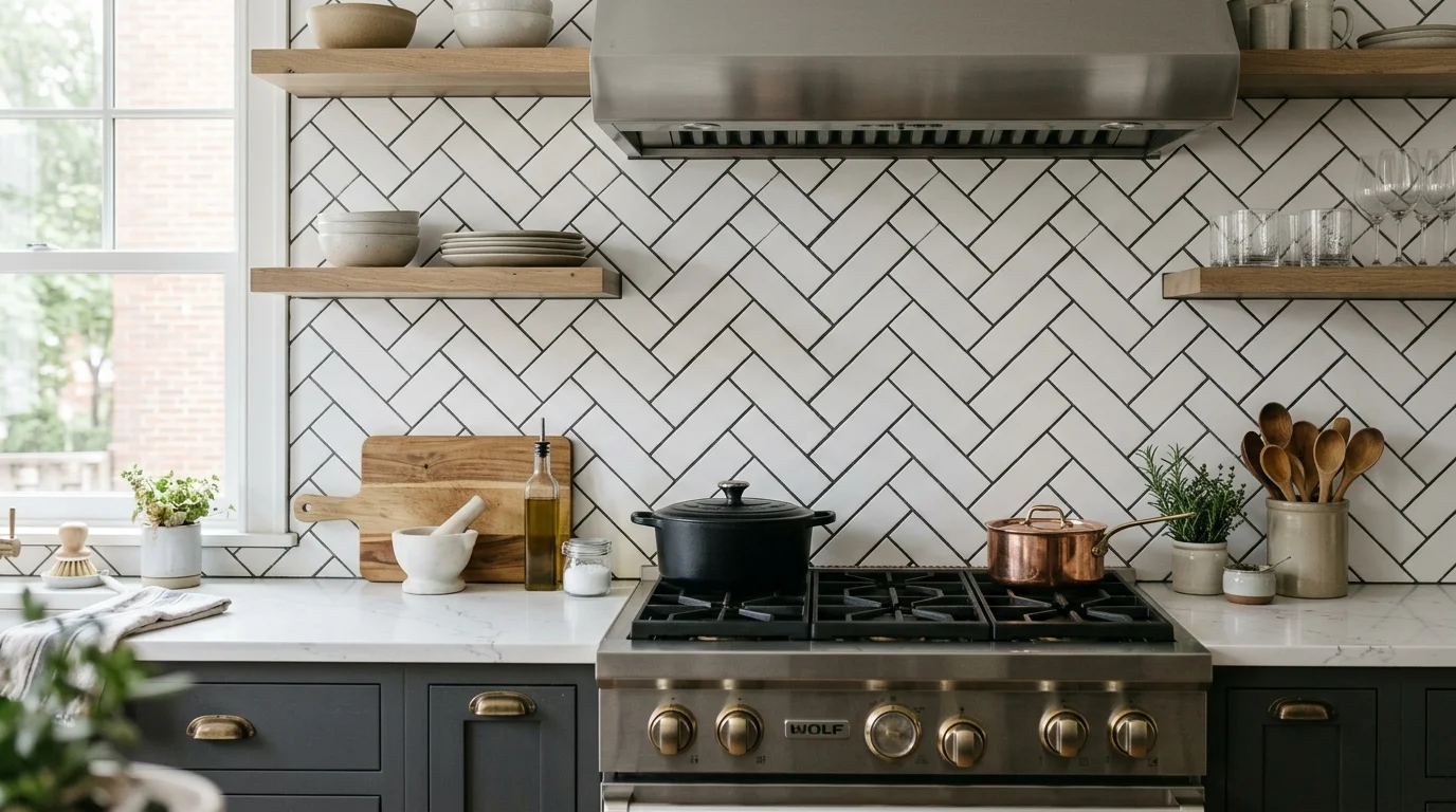
A subway tile backsplash looks intentional when its layout, grout, finish, and exposed edges work together. Choose those details before installation, especially around outlets, windows, cabinets, and the range.
Why subway tile still wins
Subway tile gives you a simple shape with many possible expressions. The same rectangle can feel quiet, graphic, traditional, or playful. That flexibility makes it useful when cabinets and countertops already carry strong visual weight.
The tile itself isn’t the whole design. Proportion, surface finish, grout, and layout determine the final impression. A glossy white tile in running bond reads differently from a longer cream tile stacked vertically. Dark grout outlines every piece. Matching grout lets the wall appear more continuous.
This flexibility also helps across San Diego County’s varied kitchens. A compact City Heights galley may need a calm backdrop. A larger kitchen in Chula Vista might support a stronger pattern behind the range. Neither choice is automatically better. The right one supports the room instead of competing with it.
Start with the fixed surfaces. Place tile samples beside the cabinet door, countertop, flooring, and wall paint. Look at them in the actual kitchen during morning and evening. A sample viewed alone in a showroom doesn’t show the full relationship.
Then decide what should lead. If the countertop has active veining, keep the backsplash quieter. If the cabinets and counters are restrained, the tile layout can carry more personality. Our guide to current kitchen backsplash tile trends can help narrow the direction without turning the room into a collection of trends.
Subway tile avoids looking cheap when every visible decision feels connected. The shape may be familiar, but the design shouldn’t feel automatic.
Layout patterns beyond running bond
Running bond remains the familiar starting point. Each row shifts from the one below, creating movement without demanding much attention. It works well when you want the backsplash to support the kitchen rather than become its main feature.
A horizontal stack places the joints in straight columns. That sharper grid can suit flat-panel cabinets and simple counters. It also makes alignment more noticeable, so outlet placement and cabinet lines deserve attention before work begins.
Vertical stack turns the same tile upright. The pattern draws the eye upward and can give a short backsplash area more presence. It works especially well on a focused section, such as the wall behind a range. Extending it across every wall may feel busy if the room already contains many cabinet breaks.
Herringbone brings more movement. It can create a useful focal area, but it also produces more visible cuts at boundaries. Decide where the pattern starts and ends before choosing it. A centered composition behind the range usually feels more deliberate than a pattern that stops at an arbitrary cabinet edge.
A one-third offset offers a quieter alternative to running bond. It creates staggered movement without repeating the familiar half-offset appearance. Longer rectangular tiles often look especially considered in this arrangement.
Layout planning should include:
- The centerline behind the range or sink
- Tile cuts at both ends of each wall
- The height beneath upper cabinets
- Window returns and exposed side edges
- Outlets, switches, and other interruptions
- Transitions between full-height and standard backsplash areas
Ask the installer to show the planned starting point and edge cuts. That conversation matters more than choosing the most unusual pattern. For help coordinating tile with the whole room, explore kitchen design and 3D render services.
Grout color changes everything
Grout controls how clearly you see each tile. Strong contrast creates a visible grid. A close color match softens the joints and lets the backsplash read as a broader surface.
White tile with dark grout delivers the boldest outline. It can look crisp when cabinet lines and tile cuts are carefully planned. It can also draw attention to every change in joint width or alignment. Use that contrast because you want a graphic pattern, not because it looked striking in one inspiration photo.
Soft gray grout creates separation without outlining each tile so strongly. Warm gray, cream, or beige can connect white tile with warmer cabinets and counters. Bright white grout gives a quieter result, though the exact pairing depends on the tile’s undertone. Some white tiles lean cool, while others appear creamy beside a cooler grout sample.
Don’t choose grout from a small printed chart alone. Place the actual tile beside physical grout samples. View the combination next to the countertop and cabinet finish. The surrounding colors can change how both materials appear.
Joint width also affects the visual result. Narrow joints make the field feel tighter. Wider joints give grout more presence. Handmade-look tile may need a joint plan that accommodates its irregular edges. A more uniform tile can support a stricter grid.
Grout decisions should also account for the product’s care instructions. Ask the matched pro which grout products fit the selected tile and kitchen conditions. Confirm cleaning guidance with the product manufacturer before using strong cleaners or abrasive tools.
For a full backsplash project, the pro should help coordinate tile, grout, trim, cuts, and transitions. Learn more about kitchen backsplash tile installation before comparing material samples.
Handmade look versus machine made
Handmade and handmade-look subway tiles trade perfect repetition for visible variation. Edges may appear softer, surfaces may show gentle ripples, and glaze can look less uniform. Those details catch light differently across the wall and give a simple layout more texture.
That variation needs room to breathe. A running bond or straight stack often shows it clearly without adding another strong pattern. Combining irregular tile, dark grout, and herringbone can create too many competing signals. If you love all three, test a larger sample board before committing.
More uniform tile creates cleaner lines. Repeated dimensions support stacked layouts and strong grout contrast. This option can work well beside detailed cabinet fronts because the backsplash remains controlled. It can also provide a calmer counterpoint to a countertop with visible movement.
Finish matters as much as edge character. Glossy surfaces reflect more surrounding light and make glaze variation easier to see. Matte surfaces appear quieter and place more emphasis on color and shape. Neither finish is automatically more refined. The better finish is the one that supports nearby materials.
Pay close attention to trim. Exposed edges occur beside windows, open wall ends, and areas without upper cabinets. Those endings need a plan. Options may include matching finished-edge pieces, a clean profile, or another detail selected with the installer. Confirm that the chosen tile line includes the pieces your layout needs before ordering.
Open several sample pieces together rather than judging one tile. The goal is to see the range you may receive. A single piece can’t show how repeated color and surface variation will look across an entire wall.
Where subway tile is the wrong choice
Subway tile isn’t right when you’re choosing it only because it feels safe. A backsplash occupies a large visual band. If the rectangular grid conflicts with the countertop, cabinet style, or room proportions, familiarity won’t solve the mismatch.
It may also be wrong when the kitchen needs one continuous visual surface. A slab backsplash can avoid repeated grout lines and preserve the movement of a matching countertop material. Large-format tile can create another quieter direction. Compare the complete wall, not just individual samples.
Be cautious when several surfaces already contain strong patterns. Veined counters, detailed flooring, ornate cabinet doors, and contrasting subway grout can compete for attention. One element should lead while the others provide support.
Subway tile may also disappoint when the selected layout produces awkward fragments around outlets, windows, or short wall sections. Before ordering, ask for a measured layout showing those interruptions. Changing the starting point or tile proportion may solve the issue. If it doesn’t, another backsplash format may fit the wall better.
Don’t let trend labels make the decision. A white running bond backsplash can feel specific when its scale, grout, and edges suit the room. An unusual pattern can still feel generic when copied without considering the kitchen around it.
If the backsplash belongs to a broader remodel, settle cabinet and countertop decisions first. Building permits may be required depending on the work’s scope. The City of San Diego Development Services can help determine requirements for a specific City of San Diego project. Homeowners can also verify a contractor through the CSLB License Check.
When to call us
Complex patterns, exposed edges, uneven walls, and several material transitions benefit from a licensed kitchen remodeling pro. Modern Kitchen SD matches homeowners with licensed, independent local professionals, and the homeowner contracts with the selected professional directly. Call us at (858) 400-4623 and we’ll connect you with a licensed local kitchen remodeler.